
Valentines Box Design
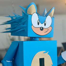
I created this Valentine’s box for my son, knowing that every detail would matter to him—and through him, so would how I made it. He’s always loved Sonic, so I leaned into that energy: bold color contrasts, playful forms, and little surprises hidden within each fold.
From the choice of paper textures, to how the box opens and reveals, I thought about the experience in much the same way I think about designing an app: What’s the first thing he’ll see? What moment will make him smile? How can each reveal feel meaningful?


Designing Joy: A Sonic Valentine
This project started as a Valentine’s Day box for my son—who loves Sonic—and quickly became a design exercise in storytelling through craft. I wanted the box to capture his excitement and personality, so I used bold primary colors, exaggerated proportions, and playful shapes to echo Sonic’s speed and attitude. The shoes, labeled “Sonic Sawyer,” became my favorite detail—personalized, bright, and full of motion. Every decision was made to create a sense of joy and wonder the moment he saw it.


Crafting with Intention
While it looks like simple construction paper and tape, this project was built with the same process I bring to UX design: empathy, iteration, and experience. I thought about how he’d interact with it—how it would feel to drop cards inside, open it up, and show it off proudly to his classmates. Each fold, cut, and layer served a purpose, guiding his experience just like a well-designed interface. Watching his face light up reminded me that good design—digital or tangible—always starts with understanding who you’re creating for.